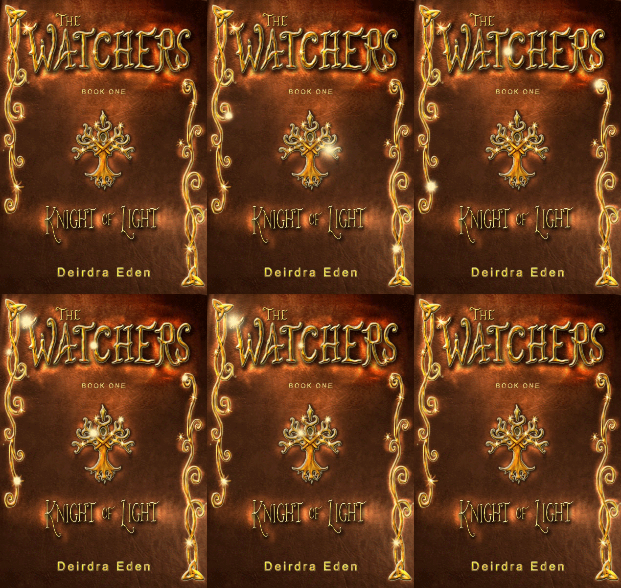
It's been really interesting to get a behind-the-scenes look at how specific the dimensions need to be for a cover. We started with just the front cover, which is often all you need for an ebook. But since this will also be in paperback (and possibly hardcover, if Spencer Hill Press likes the pre-order numbers) we needed a full jacket.
The artist/designer must meet an entire sheet of specifications, leaving an area for the bar code and other "business" type items, as well as being careful to allow enough room on the spine as the page count fluctuates. I originally wanted a picture of the local landmark that inspires the setting of Crow's Rest on the back cover, but I stumbled on another piece of art by the same artist as the background of the front cover art and knew it would be perfect.
Kelley York of X-Potion Design worked her magic on it once again. I love it! It's so lush, and by pure luck it has elements that tie into the book so well: the spiders and webs, the daisies growing in the grass, the watchful raven...
Oh, what's that? You want to see it, you say? Okay, enough stalling (click on it for a larger view)
I was joking with one of our Operation Awesome alumni, Wes Chu, the other day that I want to get this cover printed on a blanket and just wrap myself up in it--but I'm afraid that crosses the line into Crazy Author territory. But maybe it's just a perfectly natural love between an author and her cover?
You can add it on Goodreads here or pre-order it on Amazon here.

.jpg)


.jpg)


